

Cummins:
how do we help our dealerships to increase their field-service efficiency?
context
a 3-month full-time work project @ Coherence
team
2 designers, 1 project manager, 2 developers
contribution
UIUX design
onsite user research in three different cities
outcome
delivered a field-service + CRM assistant web-app that helps dealerships to get a new customer acquisition growth by ~28% and the repair efficiency improvement by ~47%.
project context
✨ ✨ ✨ Note: While the final product was delivered in Chinese, all wireframes and iteration steps in this case study have been recreated in English for clarity. This allows you to follow the design process with ease, while still reflecting the actual context of deployment.✨ ✨ ✨
our client/ Cummins China
While Cummins is best known for its engines, a major part of its long-term strategy lies in building a strong after-service ecosystem. To achieve this, Cummins not only provides parts and technologies but also partners with a large network of independent dealerships and repair stations. These stations are on the frontlines of serving customers.
business motivation/ Cummins’ wants to empower their partner repair stations and dealerships to improve profitability, strengthen customer relationships, and ultimately create a more reliable and scalable after-service ecosystem.
what is the problem?
The gap between Cummins' ambition and the reality in repair stations:
can't find new customers/
Repair stations don't know where potential customers were located or when they would have repair needs.
-> lost business opportunities
diagnosis is slow/
Once customers arrived, technical counselors spent a lot of time diagnosing issues without systematic support.
-> inconsistent and slow repairs
target user/
We are designing for Cummins’ partner dealerships and repair stations—specifically station managers who seek to grow business and technical counselors who need faster, smarter ways to diagnose and repair customer vehicles.
my delivery…
Cummins Dealership Package
a web-app to quickly locate potential customers nearby and speed up their service workflow
28%
new customer
47%
repair efficiency
32%
inbound repair conversion rate
40%
diagnostic time


what is the process…
01
understand the user
Before diving into solutions, we realized that our team had limited knowledge of engines, dealership operations, or the roles of station managers and technical counselors. This was a niche domain far outside of our everyday experience, leaving us without a reliable baseline or even hypotheses to start from. To design responsibly, we first needed to immerse ourselves in the users’ world and understand their challenges firsthand.
Goal/
❓ what do they do?
❓ what are their frustrations?
❓ how do business/service needs align?
Methods/
🚗 On-site visits, Semi-structured Interview
We conducted on-site interviews with station managers and technical counselors to explore their roles, challenges, and expectations. We also shadowed their workflows from intake to diagnosis to repair to capture real pain points in context including seeing how they have been using their current systems.
Insights/ design principles

Fit in real off-line scenarios

Low Burden

Profound Data Support

Low Learning Cost
Insights/ user pain-points
☹️
Dealerships lack visibility into nearby trucks with issues, relying mostly on word-of-mouth or repeat customers.
☹️
Diagnostic data exists but is scattered across different systems, making it hard to act quickly.
☹️
Technical counselors spend hours manually identifying root causes for engine codes.
☹️
Managers want to grow revenue, but staff are tied up in repetitive maintenance.
02
identify the opportunities

design based on the opportunities
03
initial wireframes - quick onsite mock ups
challenge/ With limited on-site time in a highly technical and unfamiliar domain, we needed to quickly turn interview insights into wireframes. These early concepts helped validate assumptions and spark feedback from counselors and managers within the short research window.
To maximize our field time, we translated user pain points into wireframes that directly mapped to the opportunities we identified—visualizing fleets, surfacing nearby leads, enabling faster diagnosis, and standardizing workflows. This ensured our exploration stayed closely aligned with real user needs while remaining lightweight for quick iteration.
See how our design sticked to the design opportunities:

04
iteration
Goal/
function validation/
❓ are the proposed functions actually helpful in daily practice?
❓ Which features are essential vs. unnecessary?
information clarity/
❓ Is all the data and info is easy to understand?
❓ Do users know what actions to take?
priority clarification/
❓ “must-have,” “nice-to-have,” or “low priority”?
❓ How do users rank the urgency of information (error codes, maintenance history, location, etc.)?
data availability & feasibility/
❓ What data can realistically be provided from Cummins? and what can not be provided?
workflow integration/
❓ How naturally do the new functions fit into existing routines?
❓ Do they actually improve efficiency, not cause more work?
user testing -> analysis -> new wireframes
User Testing/
🚗 On-site visits, Semi-structured Interview
We tested wireframes with 12 end users (station managers and technical counselors) across four representative stations in three cities, using interviews to capture their workflows, challenges, and feature feedback in context.
User Task Walkthrough
Users were asked to complete realistic tasks (e.g., “find a new lead,” “check error codes,” “update repair status”) to evaluate usability and clarity.
Card Sorting & Prioritization
Participants ranked proposed functions and information segments (e.g., error codes, maintenance history, location) to identify must-haves vs. nice-to-haves.
🤝 Client Alignment Sessions
Collaborated with Cummins’ product and technical teams to confirm which data could be surfaced immediately and which required future backend support.
Analysis/
We gathered 200+ pieces of feedback from users and Cummins stakeholders, then used on-site affinity mapping to cluster themes and surface patterns. This table is a function-level summary, showing demand, user input, and client perspective. Beyond this, we also captured detailed insights on interaction and data needs, which are reflected in the final design iterations, ensuring decisions were grounded in both high-level priorities and real user context.

5 major changes were made
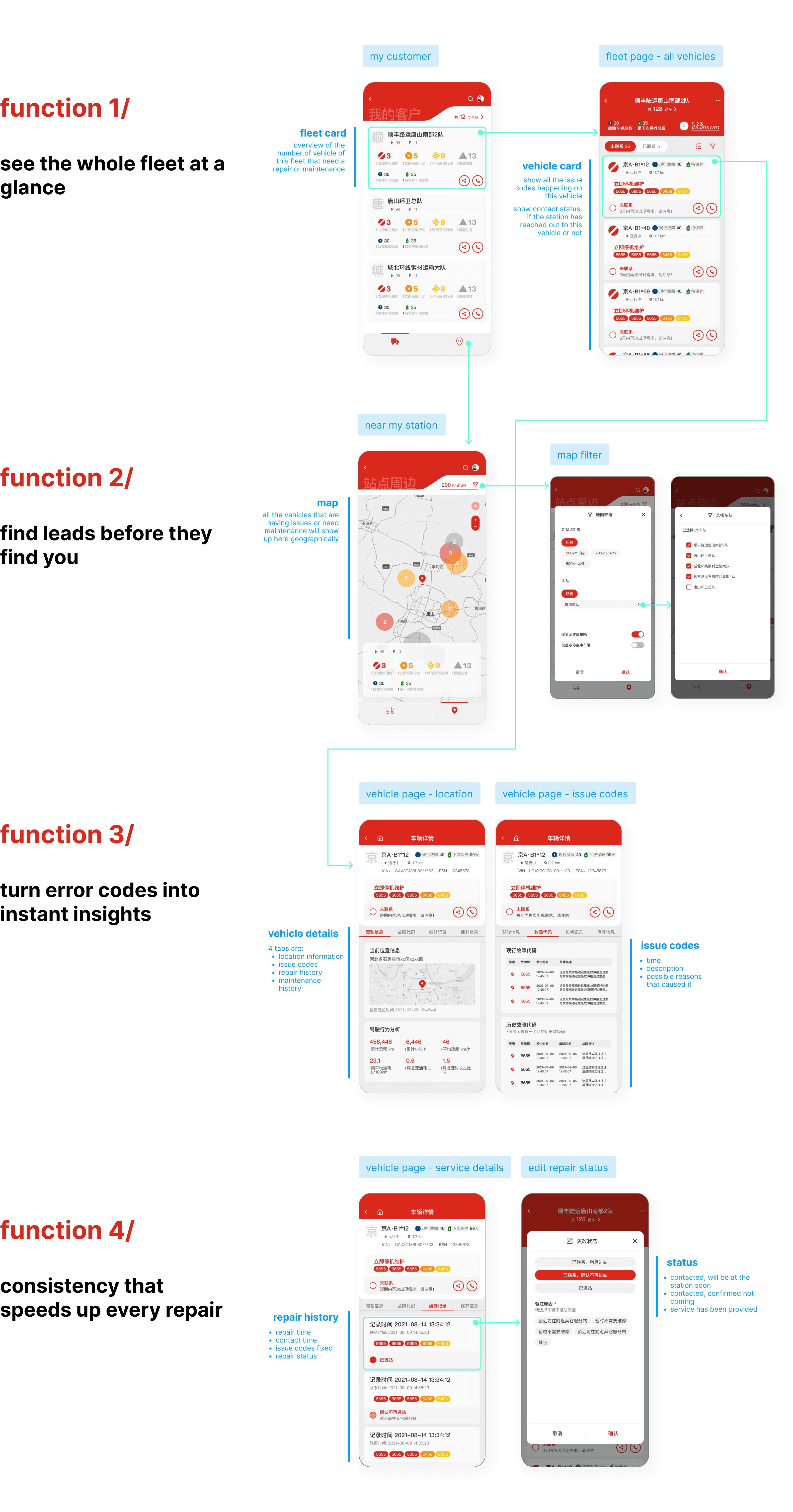
problem 1 - complex menu, low visibility of key needs/ We originally designed four main menu functions (Customer List, Nearby Vehicles, Repair, Maintenance) to mirror station services. But interviews revealed only Customer List and Nearby Vehicles were critical for daily operations. The old design squeezed everything onto the homepage, showing customers and nearby leads together, which reduced clarity and buried the most important functions.
solution - focused, simplified menu/ Refined the menu into just two tabs: Customer List and Nearby Vehicles, making urgent leads and frequent customers immediately visible while reducing information overload.

problem 2 - wrong assumption: service-type based navigation/ In the first design, we structured the menu by service type (Repair / Maintenance). We assumed stations organized their business this way, so users had to filter by fleet when they wanted to find specific customers. Interviews showed stations actually manage their business by fleet, not by service type. Trust is built with fleet managers, making the fleet entity the core unit of work.
solution - fleet-first navigation/ We redesigned the system around a straightforward fleet list, with each fleet card showing direct contact options for its manager. From there, users can drill down into vehicles within the fleet, aligning perfectly with real workflows.

problem 3 - passive distribution map/ The map only displayed a static distribution of vehicles. It looked informative but didn’t support action. Counselors emphasized that nearby vehicles and potential leads are critical for outreach. They wanted an more interactive tool, not just a visualization.
solution - interactive lead discovery/ I transformed the map into an interactive lead discovery tool. It now highlights nearby vehicles with issue categories, includes filters by distance and status, and supports quick outreach actions.

problem 4 - crowded form layout/ Individual vehicles were displayed in a long, form-style list. Because the length and detail of information (like fault codes, status, notes) varied, the layout became dense and hard to scan, making it difficult for counselors to spot urgent cases.
solution - vehicle cards for clarity/ I redesigned vehicles into individual cards that mirror the fleet card style. Each card shows key fault codes, contact actions, and appointment status upfront. This makes it much easier to scan through multiple vehicles and immediately identify priority cases.

problem 5 - fragmented view of single vehicle page/ The single-vehicle layout tried to display all possible details including actionable tasks, service history, vehicle basic information, etc. This resulted in repetitive information and a cluttered interface where counselors had difficulty scanning fault codes quickly or prioritizing urgent tasks.
solution - re-prioritized key information/ I streamlines a new hierarchy of information on this page based on the users feedbacks. It makes the page more straight forward and aligned with the existing work habits of our target users.

let's see how we have improved our design!
To validate our design changes, we conducted System Usability Scale (SUS) evaluations with 24 participants (12 per version). The initial wireframes scored 61.5, reflecting issues such as cluttered menus, unclear prioritization, and difficulty locating urgent tasks. After refining the design based on user and Cummins feedback—simplifying navigation, prioritizing fleet and vehicle views, and clarifying vehicle details—the new wireframes achieved an average SUS score of 84.2. This represents a 22.7-point improvement, moving the design from below average to excellent usability. These results align with observed gains in information clarity, ease of use, and learnability, confirming that the iteration significantly improved both user satisfaction and task efficiency.
wireframe 1.0

wireframe 2.0

26%
"feature useful"
35%
"information clear"
70%
"task faster"
32%
"easy understand"
done UX iteration!
lets move to the UI
04
UI
✨ ✨ ✨ Note: The final product was launched by Cummins China, so all the final UI designs are delivered in Chinese. We recognize that designing UI for different languages requires unique considerations - such as text length, hierarchy, readability, and cultural context. Therefore, in this section I'm highlighting only the proposal process and a concise showcase of the final pages. ✨ ✨ ✨
3 styles exploration -> 1 client choice -> 2 variants -> 1 final direction
We proposed three distinct visual directions to our client Cummins. For each style, we talked about its main attributes along with the advantages and disadvantages if they chose it.
Each direction emphasized a different brand tone—ranging from futuristic data-driven to grounded industrial trust.
Style 1 - Minimal & Functional (Cummins’ choice)
Style 2 - Industrial-solid
Style 3 - Technology-driven

Within the chosen style, we designed two UI options to test nuances in hierarchy, contrast, and layout density. One leaned toward high-contrast alerts for faster fault identification, while the other prioritized balanced readability for daily workflows.


meeting with our client Cummins,
we decided to move forward with elements designed for the blue set, but keep Cummins red as the themed color.
and it led us to the final pages


END
08
my impact
Through this project, we helped Cummins bridge the gap between their ambition to build a scalable after-service ecosystem and the daily realities of their partner repair stations. By streamlining fleet visibility, introducing interactive lead discovery, and centralizing diagnostic and service workflows, we enabled managers and counselors to focus on what matters most: acquiring new customers and repairing faster with confidence. As a result, repair stations saw tangible improvements—+28% new customer acquisition, +47% repair efficiency, +32% inbound repair conversion, and a 40% reduction in diagnostic time—demonstrating how thoughtful design can directly strengthen both user workflows and business growth.
28%
new customer
47%
repair efficiency
32%
inbound repair conversion rate
40%
diagnostic time
reflection
navigating complex research environments/ Conducting on-site research across multiple truck repair stations required adaptability and preparation of accessible materials to ensure effective interviews despite limited time and technical complexity.
balancing diverse stakeholder needs/ Coordinating between Cummins, station managers, technical counselors, and drivers highlighted the challenge of addressing multipartite needs while aligning business and user priorities.
service process thinking/ Gained insight into the end-to-end repair workflow, learning to distinguish which long-standing practices should be preserved and where design could introduce meaningful improvements.
turning data into usable insights/ Learned the importance of filtering and visualizing technical engine data—transforming raw information into actionable, easy-to-understand formats that support real decision-making.
strengthening research & communication skills/ Practiced rich field research, FTE (first-time experience) design, and client communication—balancing legal, technical, and user constraints while solving real-world problems in collaboration.